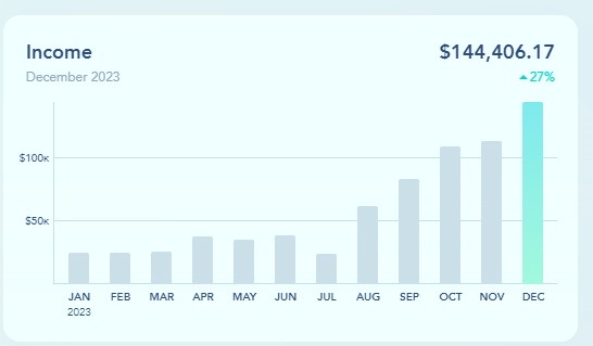
I love the graphs that focus on cash runway, cash balance & net burn. However, that immediately makes me ask if the graphs shown on the dashboard are on a cash basis or an accrual basis? Nothing tells me. And if I don’t know, I promise you my client won’t know.
In my opinion, I would rather have them be on an accrual basis, but I can see instances where I or the client would want to know these items on a cash basis as well. So ultimately, I would love the good old QBO toggle.
But in the meantime, can they at least have a label to prevent any confusion?


