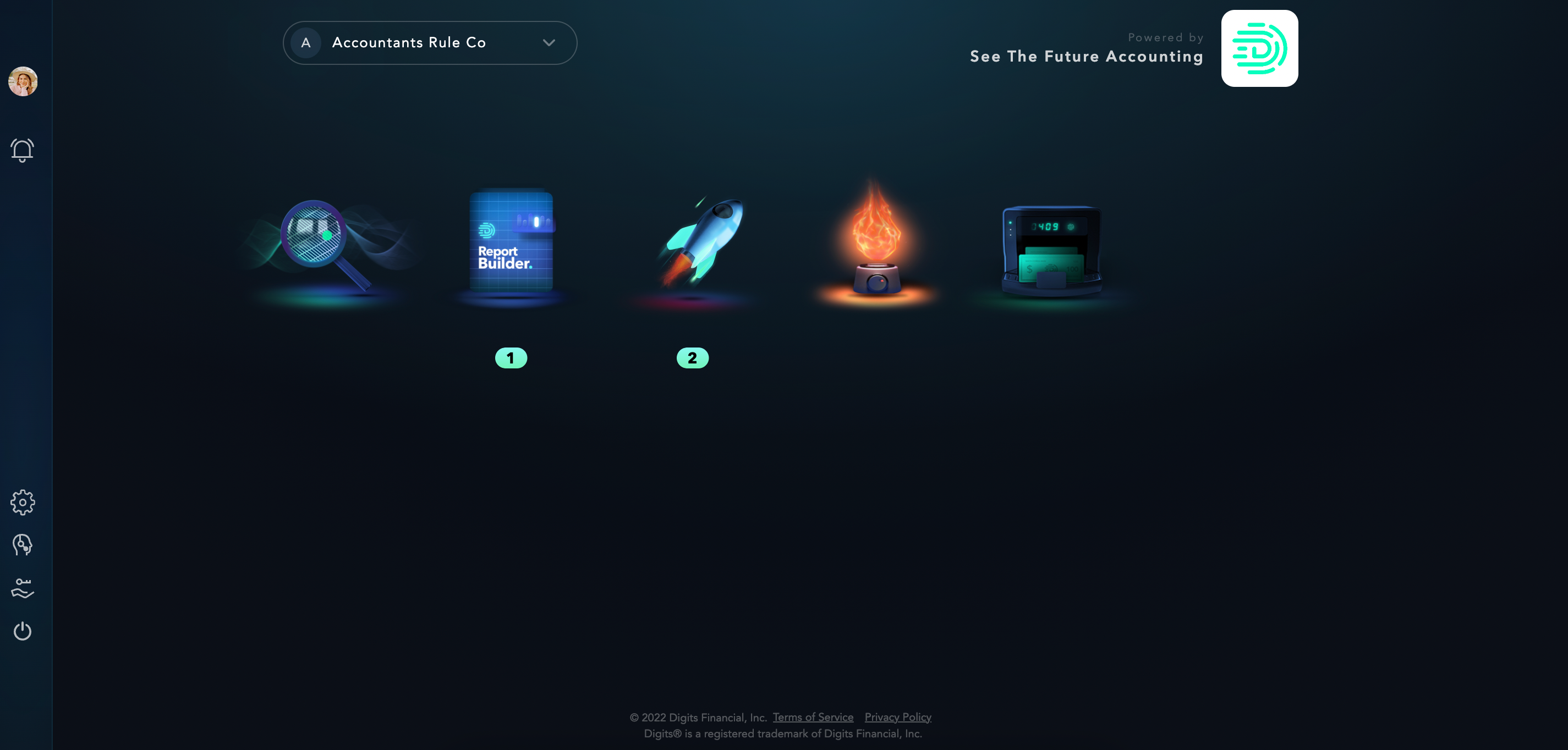
Hello everyone! We’ve just launched an updated design to your portal experience to make it even easier to navigate, focus on the client at hand, and invite colleagues to Digits.
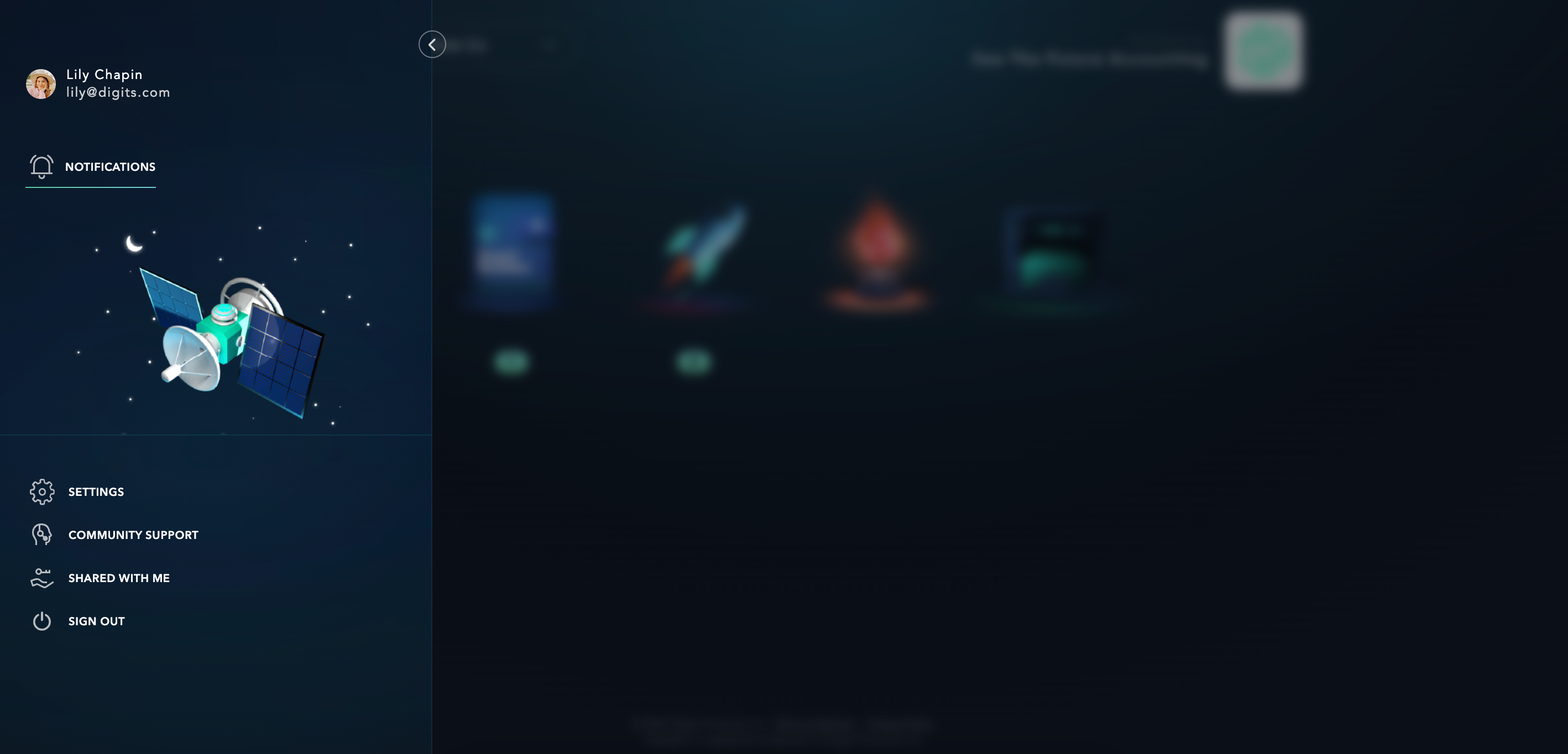
To start, we’ve introduced a collapsable sidebar on the left hand side of your screen. This will be where you can see notifications, an activity feed, contact community, view your ‘Shared with me’ page, and sign out.


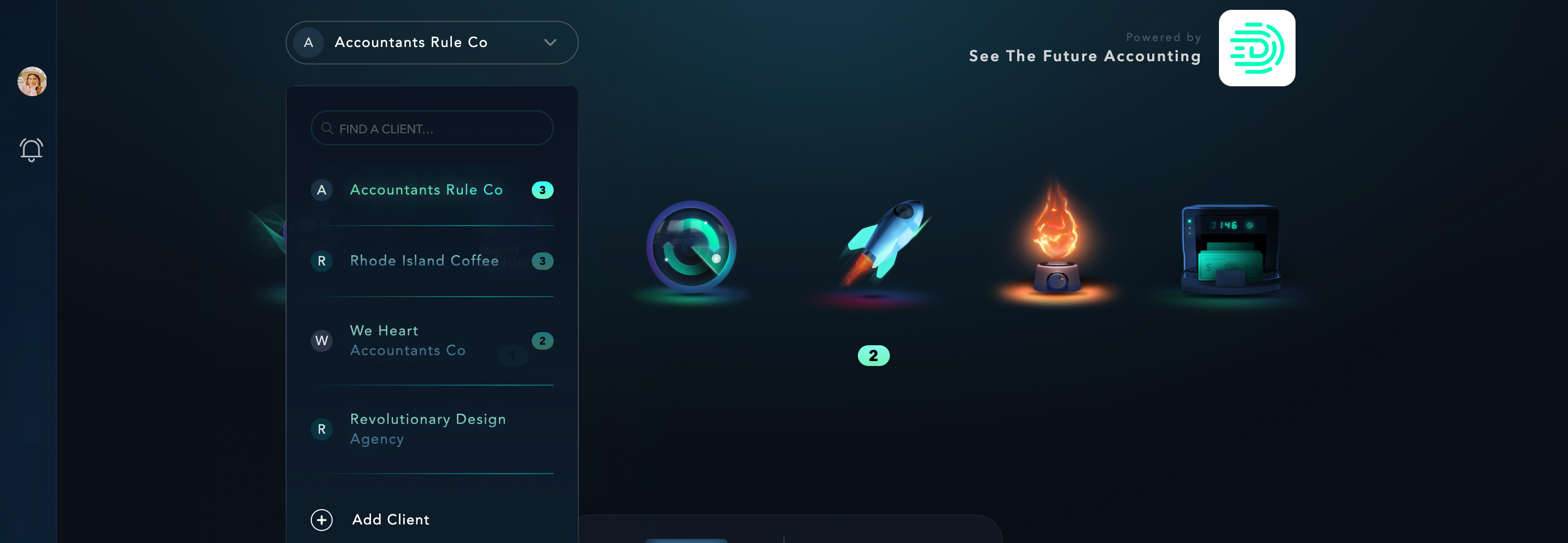
We’ve also removed the permanent sidebar that housed all of your different clients, and replaced it with a dropdown menu at the top left of your portal. This will allow you to stay focused on one client at a time without getting overwhelmed or distracted. Within this dropdown, you’ll also see a badge with a number of work items to address for each client, so you know which accounts need your attention. This is where you’ll be able to add a new client as well.

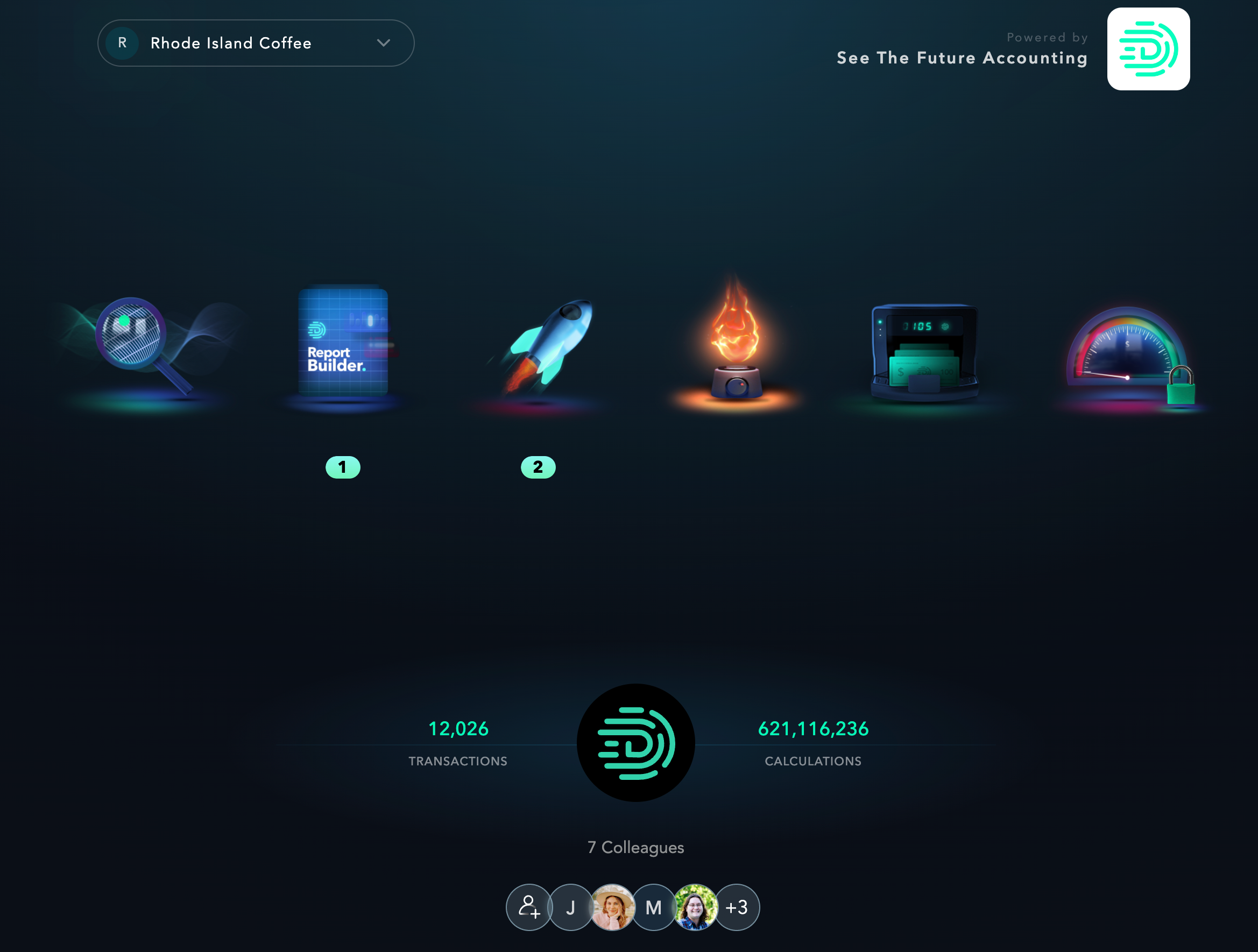
Finally, we’ve made it easier to see how many colleagues are linked to each of your clients and included a link to the settings page where you can manage and invite colleagues.

We hope these changes make your Digits experience even better! Leave a comment and let us know what you think, or if you have any questions or suggestions!
